fbpx
June 3, 2019

GooShop Marketing Campaign

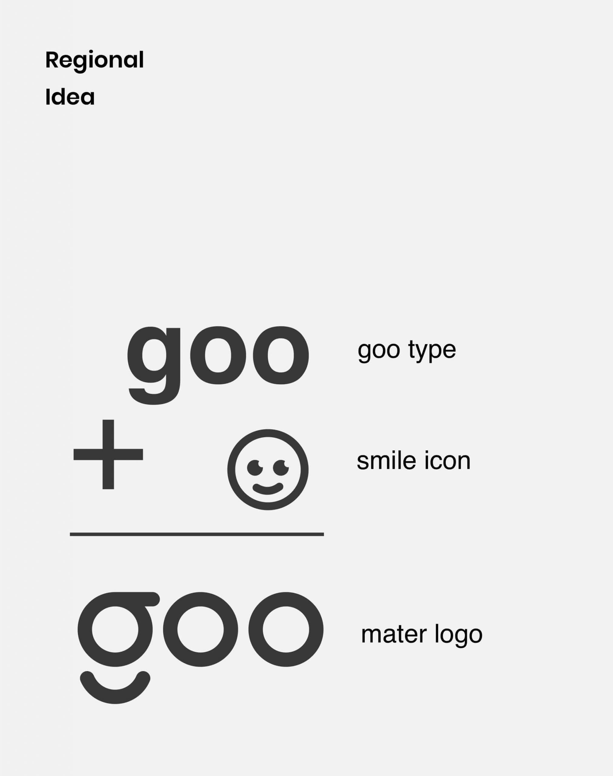
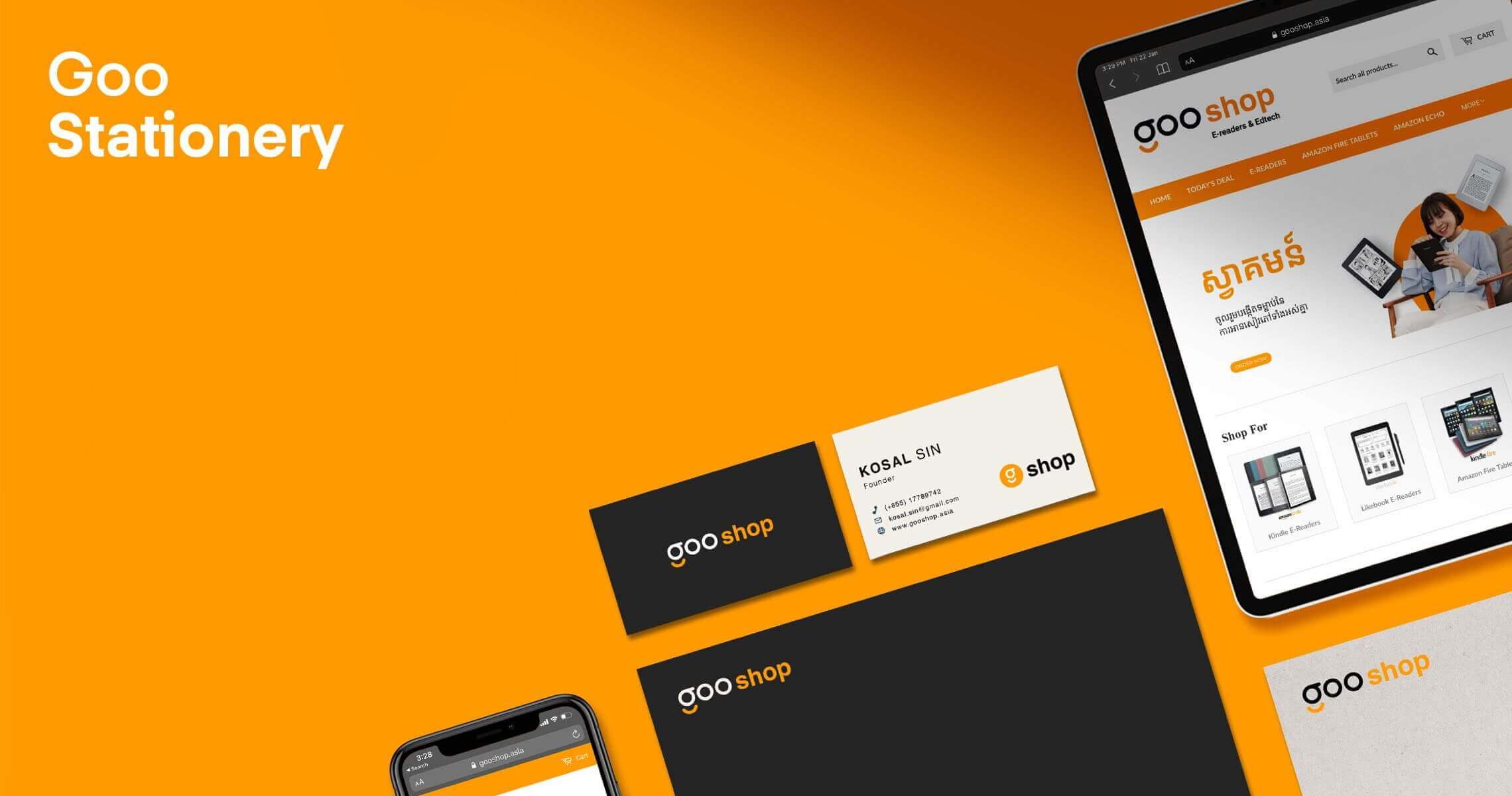
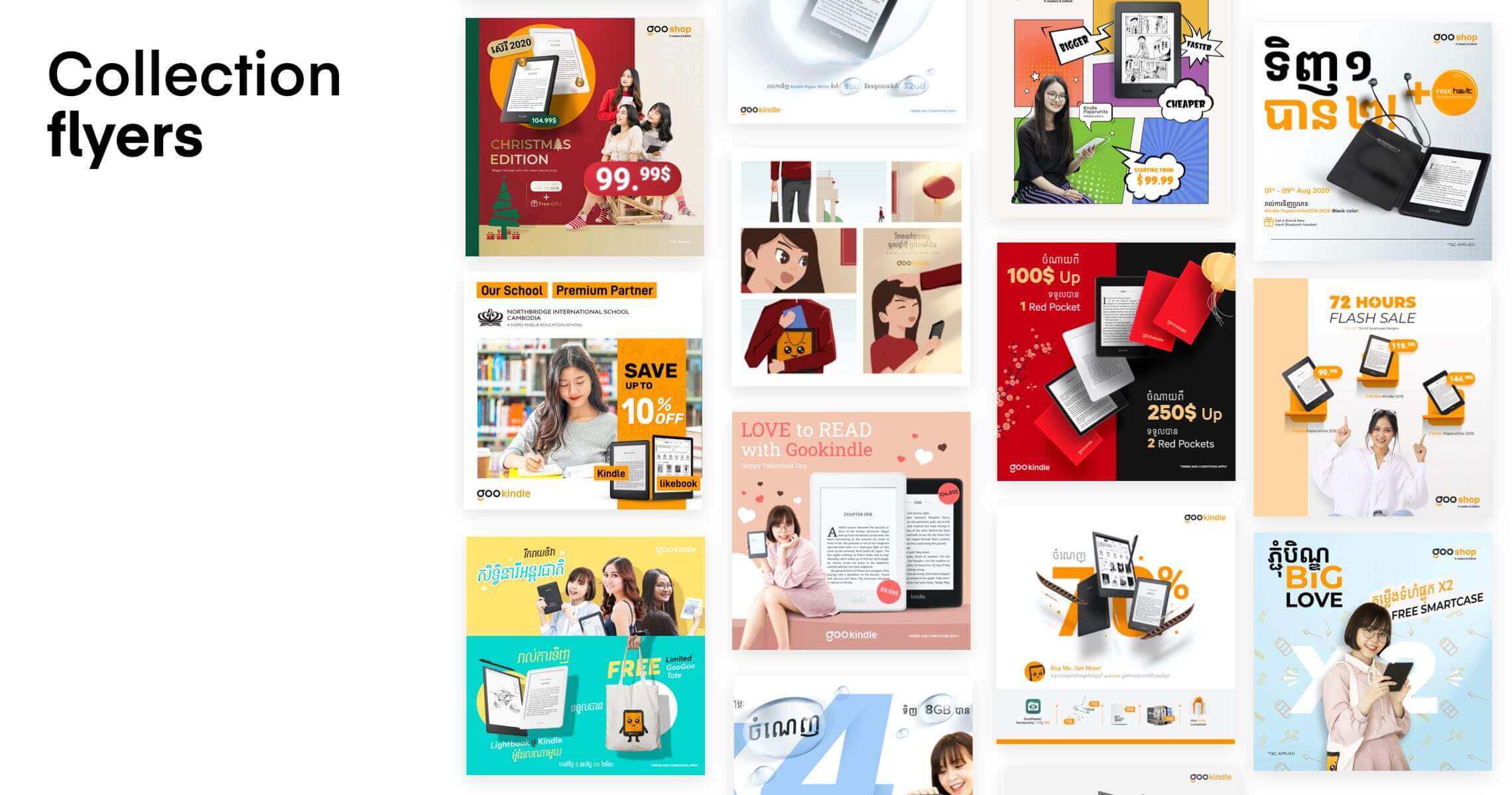
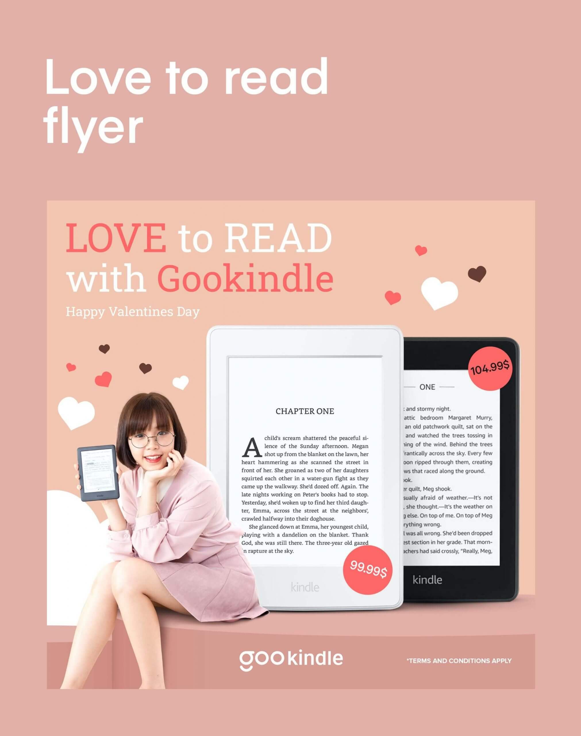
GooShop aims to promote a good habit of reading by moving forward with the best e-reader devices and educational technologies.

Task

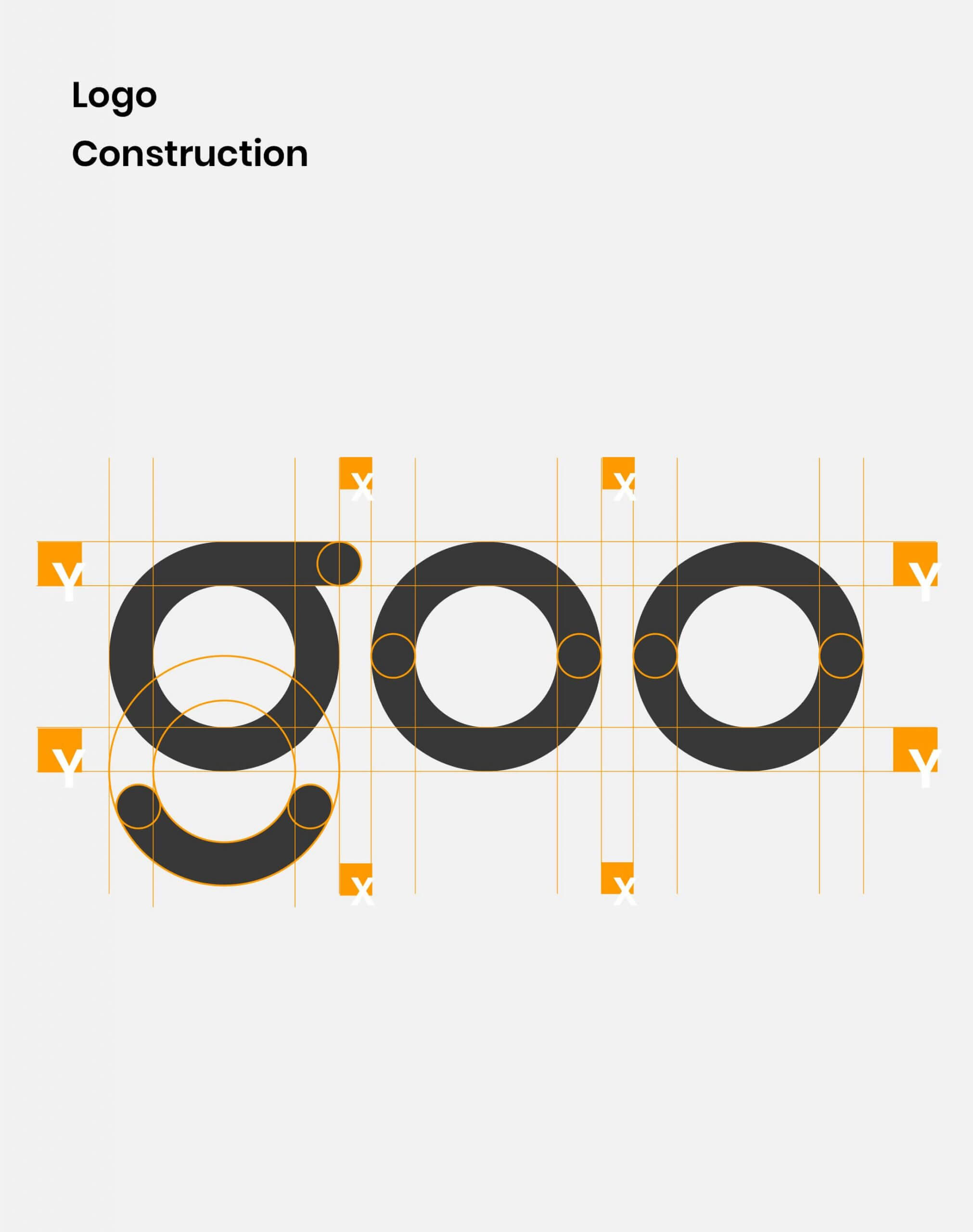
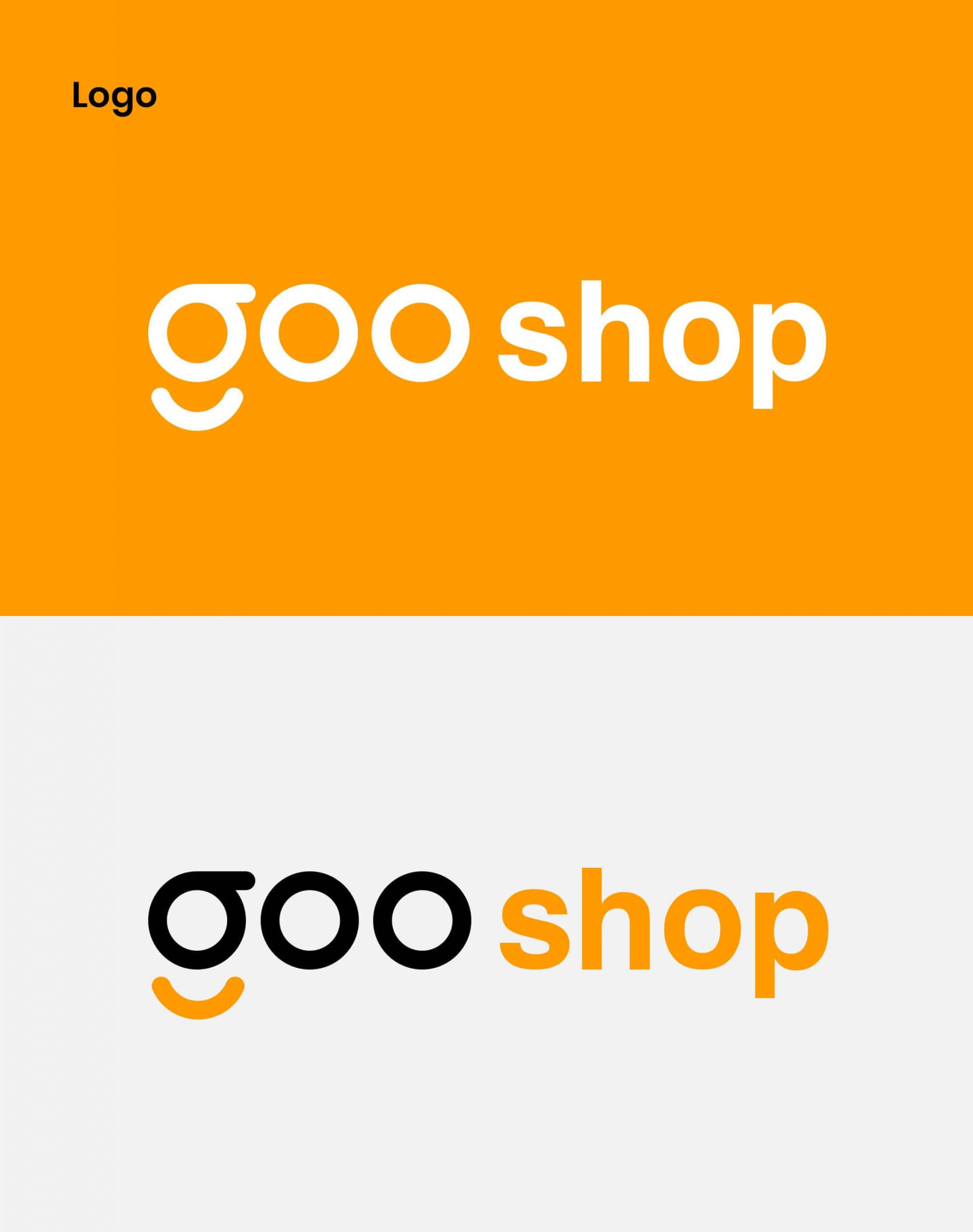
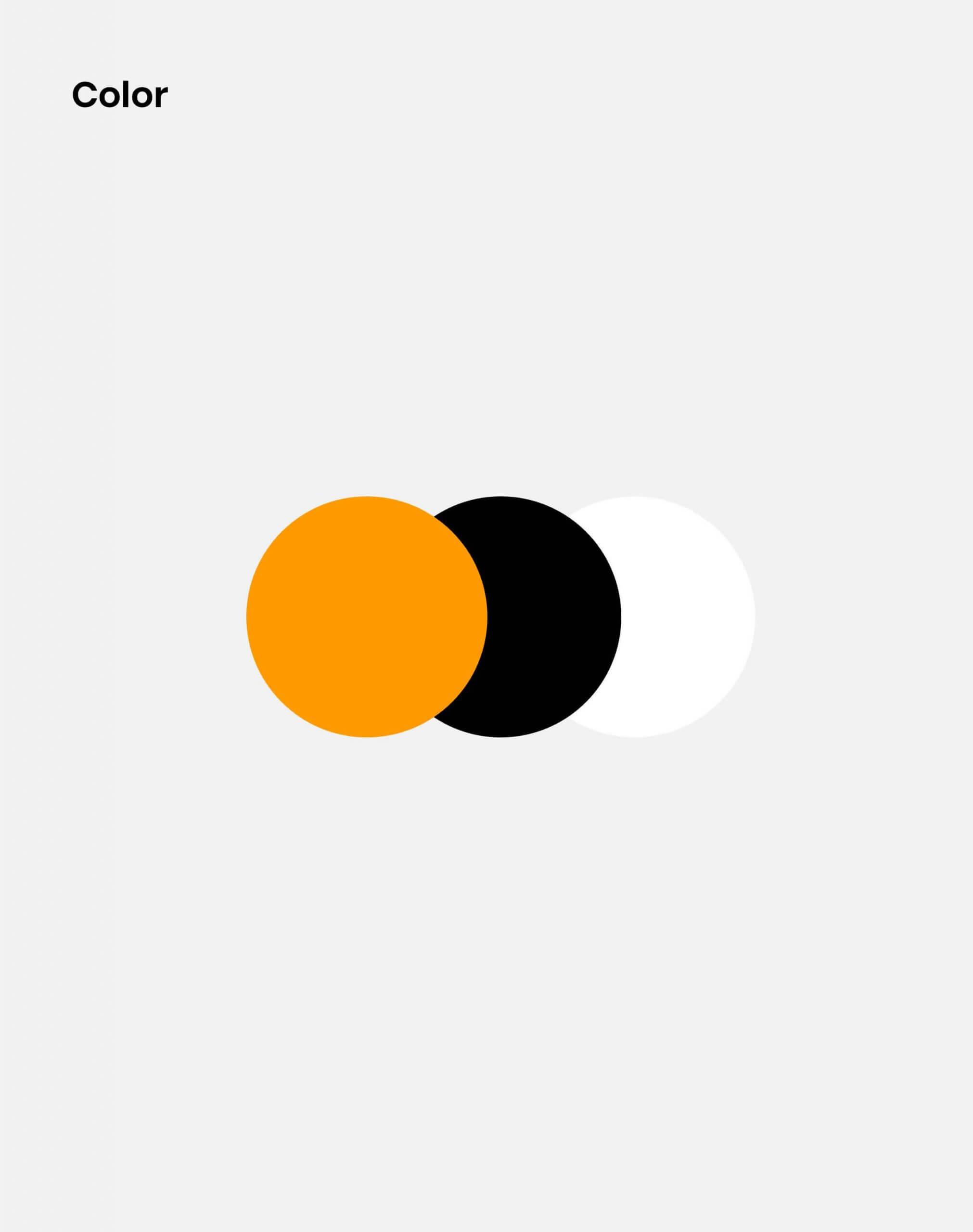
Logo & Branding, Digital Design

  • Design

    Branding design, art direction

  • Client

    GooShop

Clients
GooShop Cambodia aspires to be the first and leading force in promoting the importance of reading in Cambodia through the use of e-reader devices and other educational technologies. They provide such as Amazon Kindle, Likebook E-readers, Amazon Fire Tablets, and high-end office supplies.
The Challeges
In the beginning, the original name of the business was Kindle Cambodia, the name itself is very stick forward that the business is focused on selling kindle. The name isn't suitable for the long term since the company offers educational technologies other than Kindle. As a result, Bigeight recommends that they rethink their name and branding.
Gooshop_1
Task
In Cambodia, selling electronics education products is a very fresh concept idea but at the same time the marketing is also very critical too. Based on market research, One of the most challenging things in the market is the price. As far as educational products, their prices are reasonable. However, they will not be able to gain trust from customers unless they strengthen their branding.

Logo & Branding

Digital Design

Logo &
Branding

Start off with the name: Why gooshop? The reason behind is that they want to encourage and motivate people to read more. It can serve as a motivator for people to develop a reading habit, as well as read faster and more books. It seems that Go!Go! is two phrases of cheering. However, we used Goo! It is more powerful, in a single phrase. (why choose that name ?)
Brand Color Palette. A neutral color palette, with black and orange as the primary colors, was chosen to maintain the minimal brand direction. Various shades of grey were added as secondary colors to allow flexibility in brand roll out design without detracting.
Gooshop_logo
Gooshop_logo
Gooshop_logo
Gooshop_logo

Digital
Design

All successful rebranding projects Gooshop something from the old brand into the new, creating a sense of familiarity for the brand's clients, target audiences and admirers.
Big8_Flyer
love_flyer
Women_flyer
The results
It's been such a pleasure working with the team Gooshop. The commonality that we share in our approach for human centric design and simplicity has made the entire process a smooth sailing.

Let’s collaborate

Got a project?

We’re a team of creatives who are excited about unique ideas and help fin-tech companies to create amazing identity by crafting top-notch UI/UX.

Post a comment

Your email address will not be published. Required fields are marked *